The National Tremor Foundation unveils new logo
The National Tremor Foundation is pleased to unveil their new logo. The new design was initiated to reflect a modern, welcoming charity moving forward.

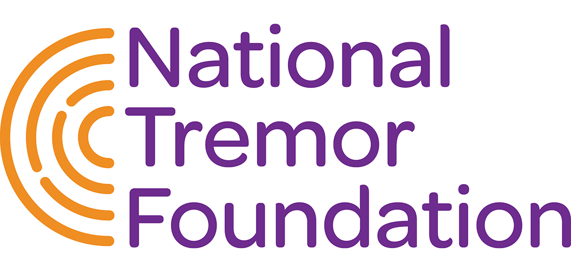
The new NTF logo
As well as having a new logo, the National Tremor Foundation website will be given a design refresh and the neurological tremor brochure and leaflets are in the process of being redesigned.
The new logo design uses concentric circles as the key graphic device. These not only represent the symptoms of tremor but can be seen as a symbol of coming together, converging and support.
The colour orange was selected to balance warmth, friendliness and vibrancy which is anchored with the stable calm colour purple to reflect the organisations expertise and experience.
The new typeface Omnes is well formed, modern, clean, and geometric. They have soft, curved edges which give them a humanistic, warm feel.
Watch this space for more updates as the branding moves forward.
Further reading


